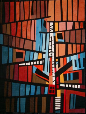
 Both Carla and Dianna said my "Landmark" resembles the Sydney Opera House. I can see the resemblance in the gothic arch shape and also the horizontal rectangles. Interesting. I didn't have the Opera House or any other actual landmark in my mind at all. Maybe it was there subliminally.

Thursday, August 31, 2006
Hmmmmm—maybe
Both Carla and Dianna said my "Landmark" resembles the Sydney Opera House. I can see the resemblance in the gothic arch shape and also the horizontal rectangles. Interesting. I didn't have the Opera House or any other actual landmark in my mind at all. Maybe it was there subliminally.
Wednesday, August 30, 2006
Landmark completed
 Well, I ended up going with neither option. I decided the two ideas I showed yesterday both had too much going on and went with a much simpler composition.
Now I am not so happy with the colors I chose. I wish I had used something warmer. I will be playing with this idea some more. Perhaps this is only one of a series of "landmarks".
The actual piece, by the way, does not include the black background, but my plan is to mount this on a stretcher covered with black fabric.
Tuesday, August 29, 2006
Landmark
 OK, so this is the idea that I have been pondering. Some sort of architectural thingie. Some sense of structure, but in the abstract. This is small. It measures about 5.5" x6" and I think it is supposed to be part of a larger, though not too large, piece.
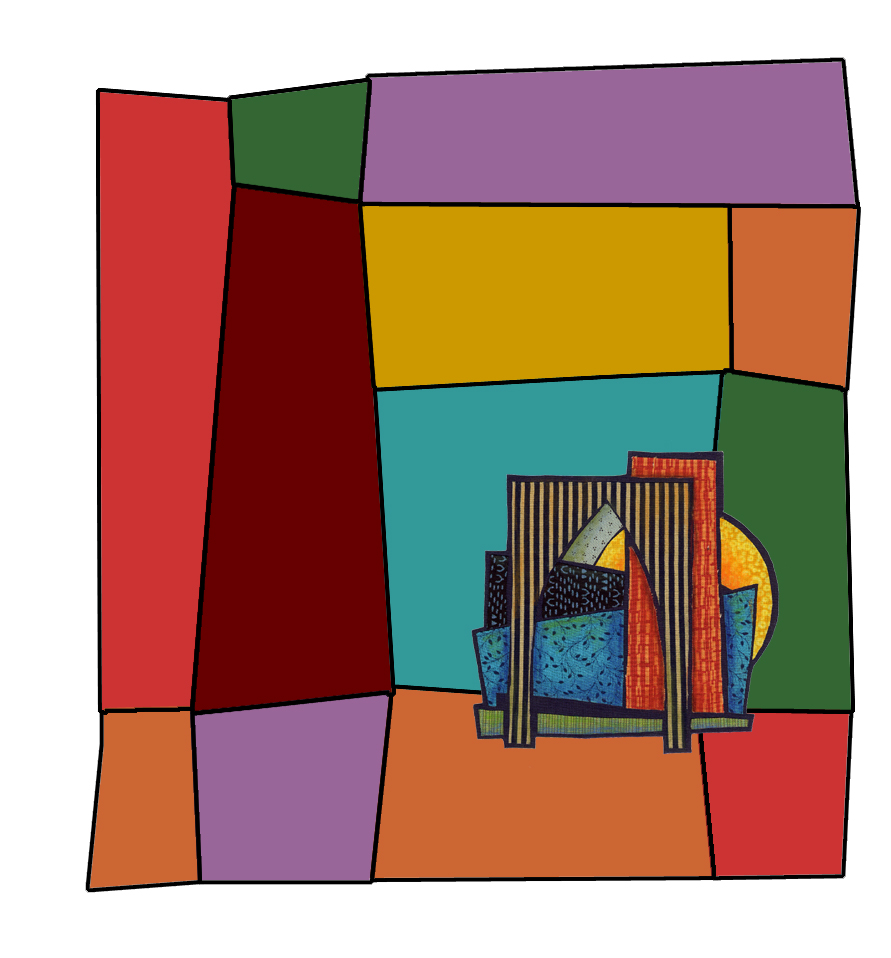
I scanned it and opened it in Photoshop to fool around with. Here it is on a larger background. I think it is overwhelmed by the background.
 Here's another version. Smaller background—same basic shapes as the other one. Darker colors. I think I like this better. I'm still thinking.
Bugz
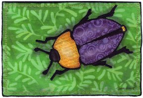 I made a couple more postcards for Fiber Art for a Cause. You may recognize the beetle motif. I made some larger beetle pieces several months ago and thought they would work for the small format postcard size as well.
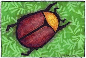 I now have seven altogether to send. It would have been nice to send more, but I am quite happy with these and if all sell at $30 each that will be more than $200 for the American Cancer Society.
I am itching to start work on some new ideas. The postcards got me back to the workroom. Now, as soon as I hit "publish" on this entry, I am heading back to start pulling fabrics to see if I can get this thought out of my head and onto fabric.
Friday, August 25, 2006
Sunshine and Shadow
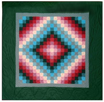 Years ago (about 20), at the beginning of my quilting career, I became enamored of Amish quilts—specifically those made in Lancaster county, PA during the first half of the 20th century. After seeing the Esprit collection at the deYoung Museum in San Francisco, and then a trip to Lancaster County, I made my own version of the "Sunshine and Shadow" design, a particular favorite of mine.
In the book, Plain and Simple, author Sue Bender says, "The Amish love the Sunshine and Shadow quilt pattern. It shows two sides—the dark and light, spirit and form—and the challenge of bringing the two into a larger unity. It's not a choice between extremes: conformity or freedom, discipline or imagination, acceptance or doubt, humility or a raging ego. It's a balancing act that includes opposites." For me it has come to represent the balance of human existance—the good and the bad, the joy and the sorrow, and how they are both a part of the whole. It's not a great quilt and the colors are really not what the Amish would have used—too match-y, too tasteful—but the quilt is a symbol and reminder of those ideas.
I have realized that in writing this blog I tend to focus on sunshine and ignore the shadow. When I showed you a beautiful day at the beach I failed to mention the stench of rotting seaweed that finally drove us from the beach. In describing the fun our group had in Seattle at the Quilt Show, I purposely avoided mentioning that between viewing of quilts and exploring Seattle, I was on the phone with my distraught sister and worrying about my nephew's fractured skull and brain injury. And when I wrote about our wonderful party last weekend I skipped the part about my aunt being taken to the hospital in an ambulance and our day, following the party, with her at the hospital which concluded with a pacemaker being implanted in her chest. And today I am a little preoccupied with the news of a lovely friend's metastacized cancer. My life is good, but not perfect. My life is pretty much like yours. No matter how warm and cheering the sunshine is, the shadows are lurking.
I'll continue to focus on sunshine—you have shadows of your own and don't need mine. But, in case you are wondering, my nephew is making good, if slow, progress; my aunt just called to say she is feeling fine and happy and lucky to have her pacemaker. My friend's cancer—well, that is something we just don't know about yet.
Tuesday, August 22, 2006
Fimo fun
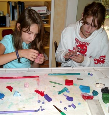 Today I showed my nieces, Steffi and Jamie, how to make Fimo beads by first making canes with a design that can be sliced and applied over and over.
Steffi was working with a purple and red palette, Jamie was using teal and green. I was using purples.
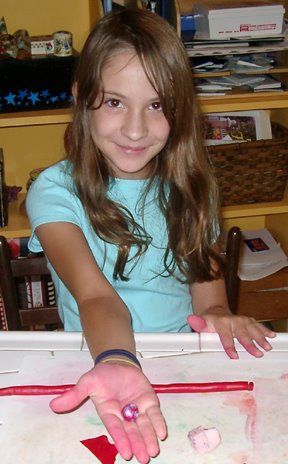

Steffie shows off her first completed bead.
I was happy to see that the girls experimented and tried out their own ideas, rather than just copying what I was doing.
 Here are our completed beads and some tins to put them in that we covered with Fimo. Remember when I bought these nice little tins at S.C.R.A.P. back in April? I knew I'd find a use for them.
Monday, August 21, 2006
Leftovers
 We had a party last Saturday. Our friends and family came to welcome my daughter and son-in-law to Portland and to celebrate their marriage, which took place a year ago in Ecuador. Emily's college friends and work colleagues came and brought their beautiful children. Our brothers and sisters and their families came. Dear friends and relatives came. North Americans, South Americans. The sun shone and a nice breeze kept it from being too hot.
Today we are enjoying the leftovers.
- Lots of yummy leftover food—if you ever need a caterer in Portland, Oregon, I can give you the name of a good one.
- Leftover kids—Our two nieces are spending a few days with us while their parents enjoy some time on the Oregon coast. We had fun shopping at Claire's Boutique, Bath and Body Works and the Junky Art Supply Store today. Tomorrow we're making Fimo beads. (I'm always hoping to be remembered as the cool aunt.)
- Leftover balloons—They're floating around the patio. Every once in awhile one bursts with a nerve-shattering BANG!
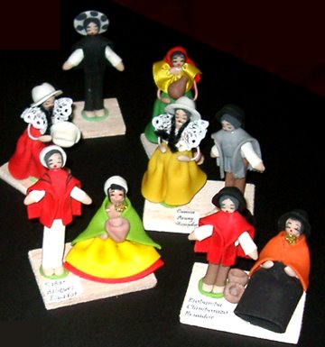
- Leftover favors—Emily and Cayo brought wonderful little figures of Ecuadorean Indigenous people and we almost forgot to give them to the guests. We missed a few of those who left first. (Sorry, Carla—I'll send you one)
- Leftover memories of a beautiful day and wonderful people.
Sometimes the leftovers are almost as good as the party.
Wednesday, August 16, 2006
APNQ wrap-up
 Here is my quilt "The Weaver" hanging in the show. It is always interesting to see your own work hanging. It looks different than it did at home. For me, it always looks smaller and a little dull. I tend to use a subdued color palette, so when my work is surrounded by work in really bright, bright colors it washes out.
There is always a lot of discussion on the QuiltArt list about whether Art Quilts really belong in traditional quilt shows and the difference between how work looks on pipe and drape compared to gallery type shows on white walls. You can see we are looking at pipe and drape here. Dark canyons of pipe and black drape.
It seems to me that while APNQ accepts a lot of "art" quilts, they tend to be judged by the same criteria as the traditional quilts and the art quilts that win awards are those that are easily understood, have elements of traditional quilts and exhibit fussy workmanship.
I got my quilts back today. The judge's comments on The Weaver included:
"The applique appears to be very precise and machine satin stitch is quite consistent."
"Strong visual impact and an air of mystery portrayed in subject. Strive for more consistency in the length of your quilting stitches."
"Excellent use of thread painting on painted fabric. Knife-edge finish is well done."
Fair enough, and flattering in some instances, but it was clear they were more concerned with technique than design and content and meaning. Oh well. It is what it is and I understand now why my favorites weren't usually the judges' favorites. I don't notice the length of quilting stitches and don't particularly value consistency in the satin stitch.
Two years ago we were all quite disappointed in the jurying of the show. There were two large machine embroidery sampler quilts that were literally identical, not very interesting and, it turns out, were made in a class. There were at least three quilts made from this commercial pattern. There were a group of nearly identical quilts all made in another class. For such a large pool of quilts to choose from we expected more originality. This year's show was much better in that regard, though we did encounter a few quilts that were both poorly constructed and dull, dull, dull. You have to wonder what the jurors are seeing sometimes. Still, there was a lot to enjoy, as I have shown in the previous posts.
In two years the show will move to the Seattle Convention Center, a much larger venue. Will we go back? Absolutely. It's a getaway weekend that we look forward to for two years. The Quilt Show is just an excuse.
Tuesday, August 15, 2006
More APNQ Quilts
 Continuing with some of my favorite quilts at the APNQ Show in Seattle last weekend, I loved two quilts, both by Borg Hendrickson. One is "Fences Two #9" and the other is "Fences Two #8". I don't know which is which.
The colors, and the way they glow, first attracted me to these pieces,
 then I began to see the rhythm of the repeated shapes marching up and down those angles. It is easy to imagine buildings and windows and ladders and fire escapes in a funky little cityscape in each one.
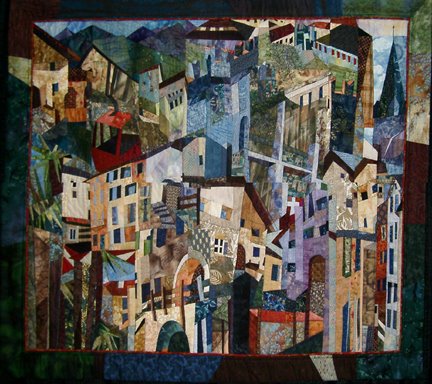 So, here is a more straight-
forward cityscape, "Lugano to Zurich" by Karen Hanken. I just loved the wonkiness of the buildings and the sense of building crowded against building and surrounded by mountains. This was the one quilt in the show that made me think "I wish I had made that."
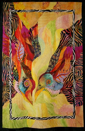 My final "favorite" is "Birds of Another" by Barbara Olsen. I have seen Barbara's work over the years and have always loved the way she uses patterned fabrics in combination with hand-dyes and her masterful touch with curved piecing. These birds may be my favorite of her quilts. They have presence, and look at that wonderful negative shape between the two birds.
None of these quilts had ribbons on them. I loved them more than most of the quilts that were awarded prizes. It just goes to show that—well, actually I don't know what that shows, but I do feel like my ribbon-less quilts were keeping pretty good company.
Tomorrow—I'll show you how my quilts looked hanging in Seattle.
Monday, August 14, 2006
Weekend in Seattle
I could almost not write about our weekend, but instead send you to other people's blogs. Gerrie posted pictures from the train and the view from our room. Melissa posted a picture on her blog of the "Best of Show" quilt "Kitty corner" by Portlander, Janet Fogg. As it happens, Gerrie and I are in her photo, looking at the quilt. We got to meet both Melissa and another blogger, Nikki, at the show. What a small world it truly is.
 Our group always goes to this show to see the show, to enjoy being in Seattle and to enjoy being together. We have yet to be disappointed. Our train arrived later than expected so we hurried to the hotel and then out for a wonderful dinner at the Mediterranean Kitchen, a restaurant we discovered two years ago when we made the same trip.
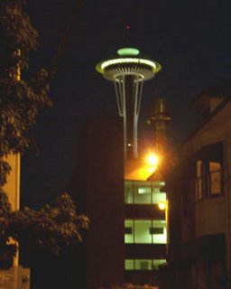
 We stepped out of the restaurant into the balmy Seattle night and were struck by the dramatic sight of the lighted Space Needle. Everyone grabbed cameras and did their best to capture the essence of that beautiful evening.
 Later I'll post quilt pictures and tell you a little about the show.
 Our group always goes to this show to see the show, to enjoy being in Seattle and to enjoy being together. We have yet to be disappointed. Our train arrived later than expected so we hurried to the hotel and then out for a wonderful dinner at the Mediterranean Kitchen, a restaurant we discovered two years ago when we made the same trip.
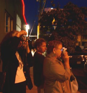 We stepped out of the restaurant into the balmy Seattle night and were struck by the dramatic sight of the lighted Space Needle. Everyone grabbed cameras and did their best to capture the essence of that beautiful evening.
 Later I'll post quilt pictures and tell you a little about the show.
The Show
The APNQ (Association of Pacific NW Quilters) Show is held every other year and describes itself as: "A juried and judged exhibition of the finest quilts from Alaska, Alberta, British Columbia, Idaho, Montana, The Northwest Territories, Oregon, Washington and The Yukon." This was the 7th show. I have seen most, if not all, of them and had quilts juried into two of the shows.
 We started out looking at the quilts in the "Winners Circle". I have to say I seldom agree with the judges. Once again, I found that I might have chosen different winners, but I also felt the winners showed skill and originality. One I particularly liked was Heidi Lund's "Blueberry Chrysalis" shown at left. The "blueberries" are 3-dimensional, with beading inside and around them. I am generally not fond of a lot of beading and embellishment, but I found this piece quite delicate and lovely, with wonderful texture and surface interest. It was judged "Best Small" quilt. I'm still trying to figure out why I liked it so much, when it is just not the kind of quilt I generally fall for and I don't much like blue!
 Another quilt the judges and I agreed upon was "Frutti di Mare IV" by Carol Jerome, which won the ribbon for first in the Innovative Applique category. You can click on the picture to see a larger image. These wonderful fish include fish patterned with cherries, blueberries (am I sensing that blueberries might be the next big thing?) and olives. The colors are rich and complex and the quilt makes you smile.
 And speaking of making you smile—how about this piece called "Running Naked with Scissors" by Linda Sharp? She describes it as a reminder to take risks in art and life. Unlike a lot of humorous quilts, this piece is not only clever and witty, but exhibits great design, masterful drawing and color that sings. And it has scissors—and I love scissors. The judges passed it by, but I give it a virtual ribbon for pure delightfulness.
Tomorrow I will share more of my favorites from the show.
Friday, August 11, 2006
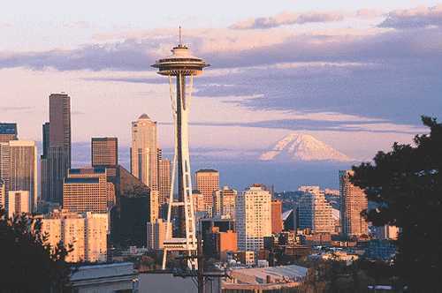
Headed for the Emerald City
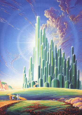 No, not this Emerald City. . .
this Emerald City.
Our small group is going to Seattle for the weekend for the APNQ (Association of Pacific NW Quilters) Show. It is held every other year and we have gone to the last 3. We take the train and always have a wonderful time. This year we have a new member. Gerrie will be going with us so I'm sure she will have plenty to report back when we get home.
I have two pieces that were juried into the show, The Weaver and Judith's Garden. I will be sure to take pictures and give you a rundown on the show when we return.
Wednesday, August 09, 2006
Woo hoo!
Look what I did! With Deb's help I figured out how to add a banner to my blog. It only took me about 5 hours and a lot of sweat, and swearing and teeth grinding. I may want to adjust the color, but now that it is actually there, that part is relatively easy. I am such a nerd. (She said with pride)
Tuesday, August 08, 2006
I like . . .
I started reading other people's blogs about a year ago. I started this blog almost a year ago. I've developed some opinions about blogs, and even though no one asked, I thought I'd share some of them.
Before I get started, I just want to reiterate that these are just my opinions. It's your blog and you can do whatever you want with it, even use one of those butt-ugly, gross-colored templates, and I'll probably keep reading if you have something interesting to say, but I'll probably keep wondering what you're thinking.
Before I get started, I just want to reiterate that these are just my opinions. It's your blog and you can do whatever you want with it, even use one of those butt-ugly, gross-colored templates, and I'll probably keep reading if you have something interesting to say, but I'll probably keep wondering what you're thinking.
- So, since I already brought it up, I like blogs with white backgrounds, especially if you are showing your art or pictures of beautiful flowers or scenery, or any pictures actually. A lot of people use the same white, very plain template I am using. It seems to work nicely for a lot of things. I'm not too savvy about code and such, but I did figure out how to change the colors of the title box and titles.
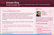
I don't like blogs with colored backgrounds. I especially don't like this pink and burgundy number. It sets my teeth on edge. I'm sorry, but your pictures just don't look that good on that pink background.
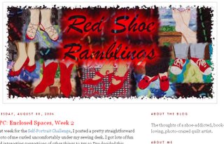
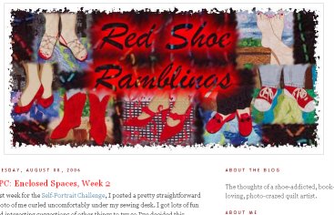
- I like personalized banners at the top of a blog. Deb Richardson's new "red shoes" banner is great, isn't it? I wish I knew how to do that. I can create the banner, I just don't know how to get it on the blog. If someone can point me to some directions I'd appreciate it.
- I like to see a photo of the blog owner up in the corner of the blog. I just identify better if I have a visual of who is talking. Some people put a picture of themselves as a child. Cute, but doesn't help me feel more connected. Likewise, a picture of their art doesn't do it either.
I will concede that there probably are some people who don't need to include a picture. If you're in the Witness Protection Program, I can cut you some slack. - I don't like ugly or goofy fonts.
Courier is an ugly font. This is Courier. It is the font you may recognize as the classic typewriter font. There is a reason it is obsolete. Reading it is tiresome. Every letter has the same spacing, so it takes up more space and just looks ugly. Proportional fonts are a vast improvement and one of the reasons that computers replaced typewriters. There is no reason to use Courier—ever. But, alas, there are blogs out there written entirely in Courier.
Comic Sans is a goofy font. Did you know there is a web site devoted to banning Comic Sans? http://bancomicsans.com/ Fortunately Comic Sans is not available as a text font in Blogger, but a lot of people like to use it for banners and graphics.
- I like blogs that are updated regularly—well, duh, who doesn't? June and Jerry Underwood's blog is updated every single day! That is laudible and highly unusual. I don't expect that kind of consistency from everyone, but I wonder why some people even have blogs. I have one on my list to look at that was started in February and has 5 entries. That is less than one entry a month. They have all been interesting, so I keep going back to see if there is more, but, no. I'm taking it off my list.
- I like artist's blogs, but I enjoy hearing about more than just their art. I enjoy cute grandchildren, and pictures of new shoes, and reports on trips and unusual sitings and even the occasional recipe. I don't like bitching and complaining. I recently read someone's blog where she listed all the things she doesn't like about her husband. It was not intended as humor. It was pretty serious. Yikes! I don't want to read that.
- I don't like memes and quizzes. Filler with little to no entertainment or enlightenment value.
- I like lots of good photos. I don't like little tiny photos that you have to click to get the view that is big enough to make out. I especially like when people go to some effort to create really beautiful photos. This blog is one with great photos. (note the nice white background template she uses) I try for good photos. Sometimes I am more successful than other times. Here's another blog with beautiful pictures, however she has been in a holding pattern for several weeks now. I hope she's busy taking lots of new photos.
- I like music in general. I don't like it on blogs. Eeeeeee! That same song, not of my choosing, over and over and over—makes me very cranky.
- I like lists of 10 items. Seems nice and neat and well-rounded, but, alas, I can't think of a good tenth item.

Monday, August 07, 2006
More postcards
 Yesterday's little landscapes were very fussy and fiddly to make, and I had an idea for some more graphic designs. They turned out to be a real departure from yesterday's work and a lot of fun.
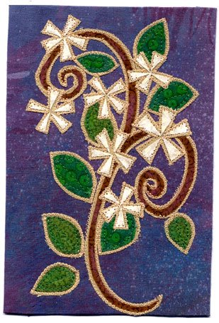
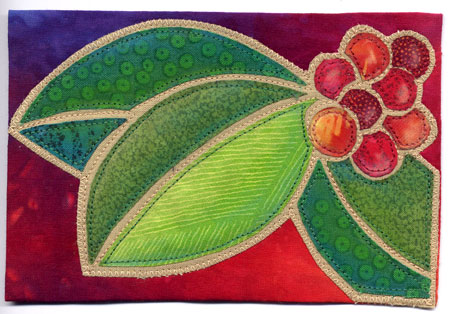
The first is "Star Jasmine", then "Bright Berries" and "Berry Thief".
I appreciate all the very flattering and kind comments about yesterday's postcards. I like them, too. And Carla, of course they remind you of SE Idaho—that is the landscape that is imprinted on my brain. We are the rare breed that thinks sagebrush is beautiful. Today's cards are more reflective of my Oregon garden.

Sunday, August 06, 2006
Fabric postcards
 Now that I have retired from one of my jobs, I really do plan to do more artwork. I told my friend June, that I might even do something big. She expressed skepticism. Today I spent the day making postcard sized pieces. It's a start.
Actually this is something I have been thinking about doing for awhile. Virginia Spiegal, who is on the QuiltArt list started Fiber Art for a Cause about a year ago and has been auctioning fiber postcards to benefit the American Cancer Society. She will be selling them at the big Quilt Show in Houston this fall and is soliciting QA members for donations of cards. All the proceeds go the ACS. It's an important cause. Both of my parents had cancer. My Dad died of a particularly nasty one—pancreatic cancer. So, better late than never, I am making a few cards to contribute.
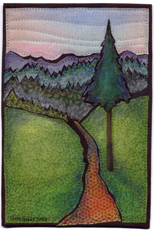
 Today I made two small landscapes. The first one is called "High Country" and the second is "Sagebrush Country".
A lot of the donated postcards are very heavily embellished, with beads and shiny threads and sparkly stuff, so I'm not sure these will fit in real well, but they were fun to do. But after I finished the second one I had another different idea I'm going to work on tomorrow. Of course I will show the results here.
Tuesday, August 01, 2006
Damn, I'm crafty
 Here's something you can do with all those old quilting magazines—I know you have them!
I saw a small bag here made from woven strips cut from magazines and covered with shiny packing tape. The idea was intriguing, so I spent several evenings figuring out how to weave a larger, tote bag size. Most of the strips actually were cut from old Quilters Newsletter magazines. I lined it with a heavy, black canvas duck. I think a good sturdy lining is essential, because the bag itself isn't very sturdy. I sewed on handles with buttons.
I wonder if it will even hold up to any kind of wear and tear. I have jury duty this week. Maybe I will take a book and a bottle of water with me and try it out.
I'm sure my family, though they are usually nice enough not to say so, wonder what motivates me to make these huge messes (strips of magazine paper ended up everywhere!) and create these strange items. Usually my motivation isn't so much the desire to own a woven magazine page tote bag, but rather the challenge of just seeing if it is really possible to figure out. And, actually, I do think it is really cool looking.
Subscribe to:
Posts (Atom)